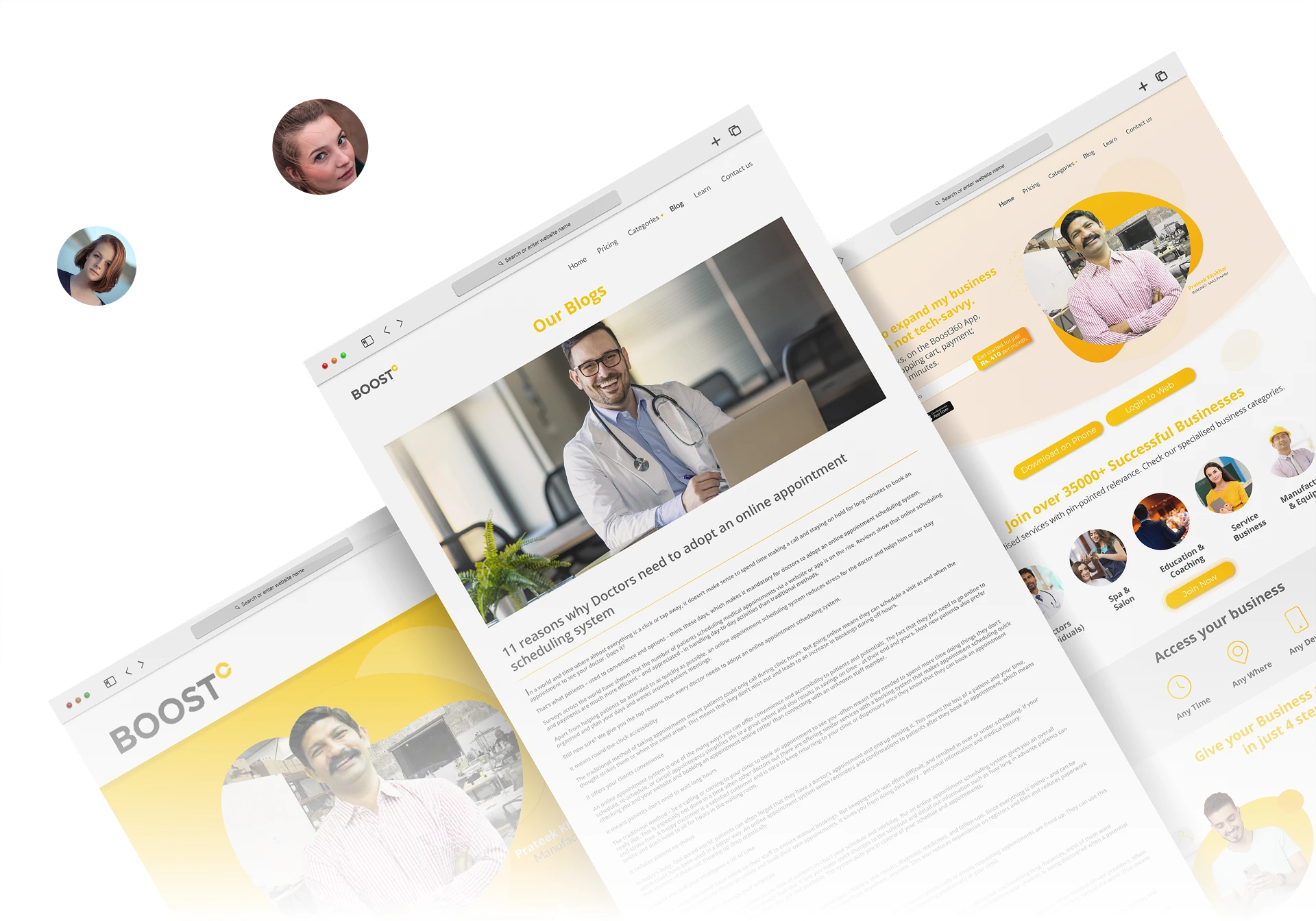
Bringing clarity and conversion together through strategic design
and user-centred approach.
The Challenge
Boost360 needed a UI that could simplify their offerings, engage users instantly, and drive meaningful action.
Earlier design struggled with cluttered interface design, vague call-to-actions, and lacked visual identity, which failed to establish clear communication that impacts of an effective call-to-action that could convey their value proposition.
Our Approach
At Purple Tuche, we reimagined the UI to solve this core problem
making information intuitive, engaging, and action-oriented.

User Clarity
Every design decision centered around making information clear and accessible to users.

Engagement
Created engaging visual elements that capture attention and maintain user interest.

Conversion
Optimized conversion paths with strategic placement and clear action points.

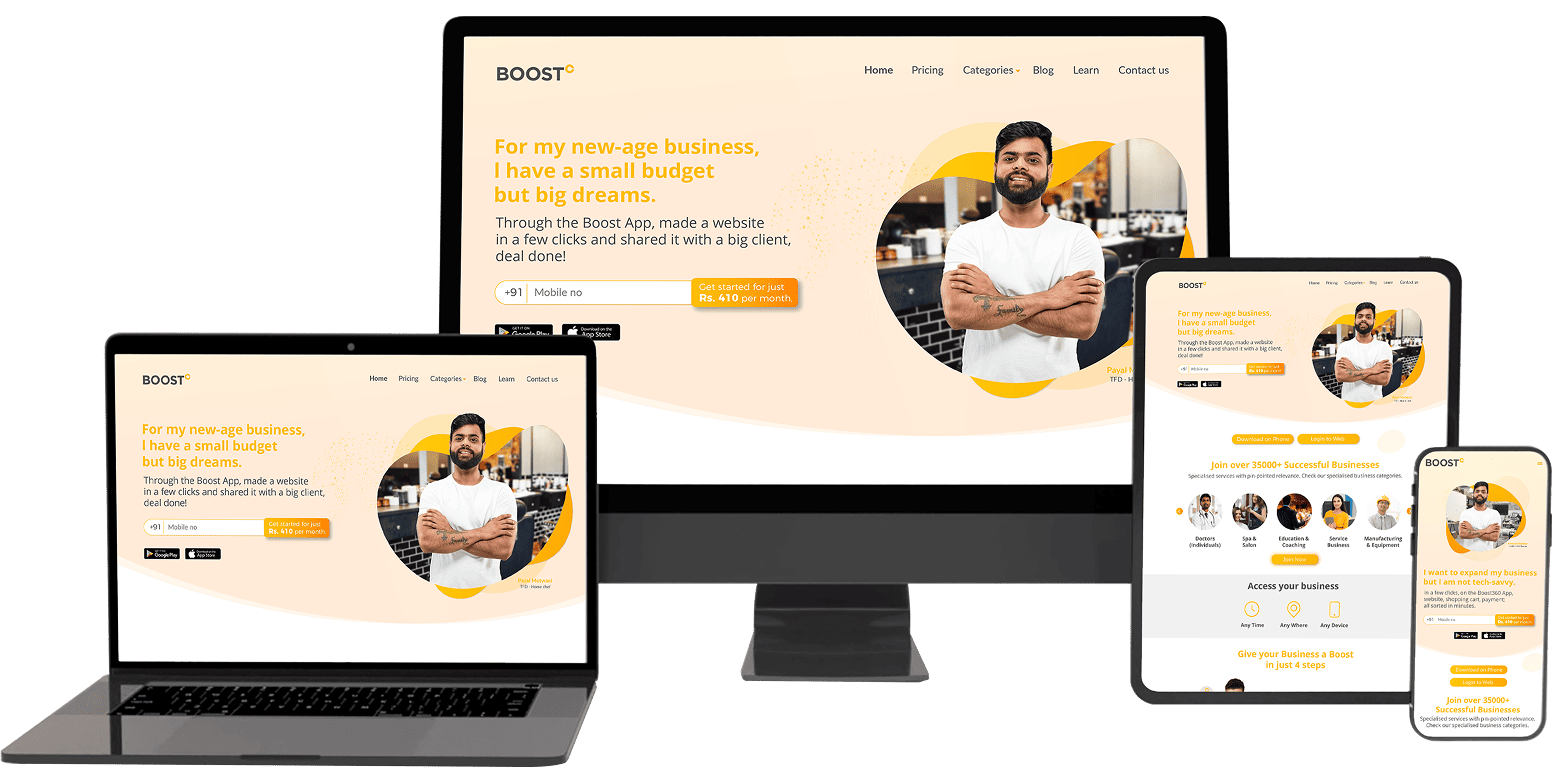
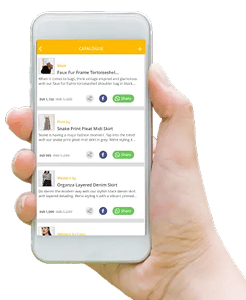
Imagery & Visual Language
We built a strong visual foundation with clean, modern imagery that reflects Boost360's dynamic energy.
The visuals highlight use-cases and real benefits, ensuring users immediately connect with the platform's value proposition.
- Clean & Modern
Minimalist approach that emphasizes content and functionality - Use-Case Focused
Imagery that directly showcases real benefits and applications
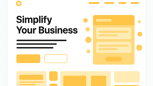
Create your website within minutes

Add products or services to catalogue
Engage in social & digital marketing

Receive orders or appointments easily

Heading 1
48px - bold
Heading 2
32px - bold
Heading 3
24px - bold
Body text that provides clear readability and comfortable reading experience for users across all devices. 16px - Regular
Effective CTA Strategy
We addressed the key problem by making CTAs impossible to miss yet
natural in placement, streamlining the conversion path.

CTAs placed at optimal points in the user journey for maximum impact

High contrast design ensures buttons stand out while maintaining visual harmony

Clear, action-oriented language that guides users toward desired actions