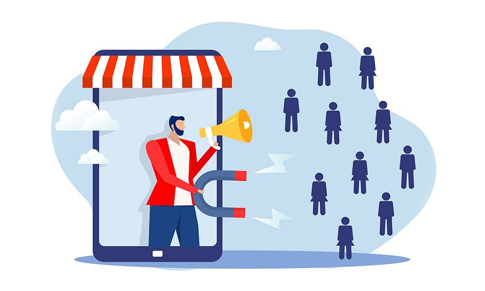

Imagine your digital platform is a big party where you are inviting people and entertaining them while their requirements are met easily and intuitively. Those people go back home with lovely memories, and they talk about your party for years, thus encouraging and intriguing more and more people into visiting your platform.
Digital platforms are the place to be, and mobile advertising is the biggest trend in 2021. With the continuation of the pandemic, people are spending more and more time connected to their gadgets. Without digital marketing and mobile advertising, it is now difficult for brands to survive. In the ocean of online websites if your content is not engaging or your website is complicated or slow you can say goodbye to customers and future traffic.
Why Is Audience Engagement Important?

‘Audience engagement should not be taken lightly by any business owner. It not only means how users like your website when they visit but also mean a total of the following:
-How do consumers or users connect with your site?
-What activity do the visitors carry out when they visit?
-Do they convert and make a purchase?
The whole purpose of a business is to sell products or services and gain revenue. For online businesses, no audience engagement means no business, and hence it is very important to measure audience engagement for the effortless running of the business. Similarly, advertisers who need traffic from a website as well as the owner of the website need to make sure that they drive traffic to the advertiser’s page. The real-time measurement of online engagement helps to run your business effortlessly.
How To Boost Audience Engagement?
Studies have shown that the first 3 seconds are the most important as they create a good or bad impression. Here are a few tips to ensure a good first impression:
1. Clutter-free logical structure:

Just like no one likes cluttered houses, the same way if your images are placed too closely or your design looks overloaded with information, your consumers can feel swamped. Additionally, consumers may feel lost and not find the item they are looking for or should be presented with.
A good visual hierarchy (a principle of arranging segments in order of importance) is vital as it helps the visitor easily scan through the site and find what they are looking for. Make sure you have ample white spaces with well-placed elements for the audience to see right away.
Here are the rules for a good Visual Hierarchy:
- Size- Make the size of important elements bigger than the rest of them
- Colours- Use no-brainer bold colours to attract attention towards specific elements you wish to highlight
- Contrast- Contrast colouring is eye-catching, and thus can be used to the advantage
- White space- It is very important to have white spaces around an element to make it stand out.
- Large headers- These always attract more attention than smaller ones, hence place important elements in large pleasing fonts.
2. Usage of Infographics:

It is rightly said ‘A picture is worth a thousand words. Using digital media like images or flash videos definitely increases audience engagement in terms of good leads. Infographics are already widely used as customers prefer that to reading paragraphs and paragraphs.
3. Enhanced speed and receptivity:
In today’s fast touch technology, no one likes anything slow. You can take your own example – how many times have you gone to a different website or just pressed the cross sign as the website has been too slow to upload? Website speed is an important factor when it comes to attracting traffic, hence, make sure your website has enhanced speed and receptivity.
4. Constant updating of content:
Just like constantly changing technology, make sure you stay on top of your game with your website. Study your competitors, use diverse content types, and update it with the latest product videos and images as it is proven to increase audience engagement and traffic.
There are a variety of content ideas which you can think of incorporating –
– Product review videos on the website
– Upload product review videos on YouTube and post them across different social media platforms
– Webinars
– Interactive quiz
– Tutorials
– Charts to present information succinctly
– GIFs that others can use
5. Suggested product:
On all FMCG websites when one selects a product below the detail section there is a ‘ You May Also Like This’ section enticing the buyer to explore more products and thus add more to their cart. Adding internal links to other products is a significant way to engage the buyer to browse more or add more items to the shopping cart. Also, by adding internal links, the likelihood of your site’s search engine ranking going higher increases thus increasing the chances of generating traffic.
6. Add lead magnets:
In simple words ‘content upgrades’, which effectively means a piece of content that is offered as a bonus to consumers and a great way to add their email ID to your email list. That way you send them links and offers of your product or services to entice them to buy. Some of the possibilities of content upgrades are:
• Discounts – a popular way for all eCommerce websites.
• Downloadable PDF Post
• Video guide to a product
• Guide eBooks
• Free templates
• Reports
• Quizzes
Add content upgrades depending upon your target audience and what will add worth to them.
7. Effective placements of Call-To-Action (CTAs):
This is very important to encourage users to do what they want thus increasing leads or sales. Effective placement of CTA also is useful as it develops trust and loyalty as consumers know that you are there to offer help. Some examples of CTA are:
• Below is a blog – Learn More
• Below is a product – Free trial or Guide or again learn more
• Below is a training workshop – need help or book your workshop
• Financial services – arrange a callback
• General – contact us
Make sure they are aligned correctly with concise wordings, easy to read, see, and easy to click.
8. Incorporate live chat or Chatbots:
For first-time users or to avoid consumers facing glitches on your site have one-click consumer support, so users do not spend time looking for help or just leave the site altogether. Another advantage is 24/7 help; this helps the business with lead info and consumers with any time anywhere help.
9. Do not forget Error pages:
This is also referred to as the 404 pages. Many times, you might have taken out a product from your list. So instead of the site going to an error 404 page, customize the page with maybe ‘Sorry this product is no longer available, or this page is not there’ and direct the consumers to similar pages.
Not to worry!
It ain’t rocket science – as Leo Burnett, founder of Leo Burnett worldwide said, “Make it simple. Make it memorable. Make it inviting to look at. Make it fun to read.”
Frequently Asked Questions
Audience engagement determines how visitors connect with your site, the actions they take, and whether they convert into customers, directly affecting a business's success and revenue.
The first 3 seconds create a crucial first impression that can make users stay or leave, so the site should be well-structured, visually clear, and easy to navigate to engage visitors immediately.
A clutter-free layout with a good visual hierarchy allows visitors to quickly find what they need without feeling overwhelmed or lost, improving their experience and engagement.
Infographics and images are effective because they convey information quickly and attractively, which helps keep visitors interested compared to long paragraphs of text.
Fast website loading is crucial since slow sites frustrate visitors leading them to leave, so enhanced speed and responsiveness increase user retention and engagement.
Constantly refreshing content with new videos, images, and diverse formats keeps the site dynamic and relevant, encouraging repeat visits and longer engagement.
Suggested product sections entice users to explore more items, increasing the chances of additional purchases and improving site navigation and SEO through internal linking.
Lead magnets like discounts, guides, free templates, or quizzes provide extra value that encourages visitors to share their contact details, enabling follow-up and higher conversion.
Effective CTAs guide users toward desired actions like buying or contacting, building trust and improving conversion rates through clear, easy-to-find prompts.
They provide instant assistance and 24/7 support, reducing user frustration and helping capture leads by answering queries in real-time.
Customizing error pages with helpful messages and links to related content can keep visitors on the site instead of losing them to frustration.
Stay in touch
Well send you latest business & marketing news, inspiration, cost finds.


